3L
Identities
- Client
- Ricoh Company, Ltd.
- Director
- Jun Inada
- Design
- Yoshihisa Tanaka, Yutaro Yamada
- Supervisor
- HIROYUKI TANAKA ARCHITECTS
- Wall drawing
- Hiraku Suzuki
- Web design
- Shed Inc.
- Interior
- TANK Inc.
- Cooperation for sign
- Fujiwara Earthen Art Studio, Paint Factory
- Period
- Oct 2020
- Photo
- Kenta Hasegawa, Den Gai
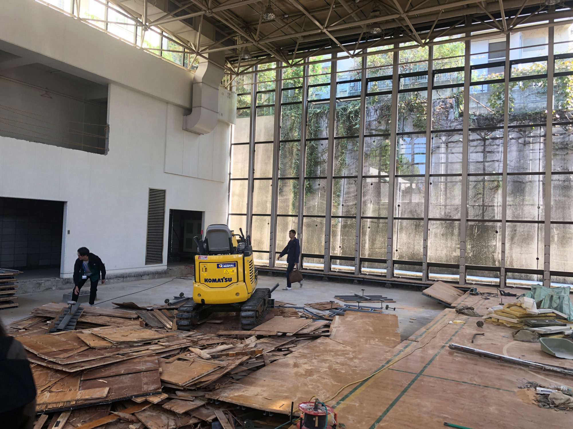
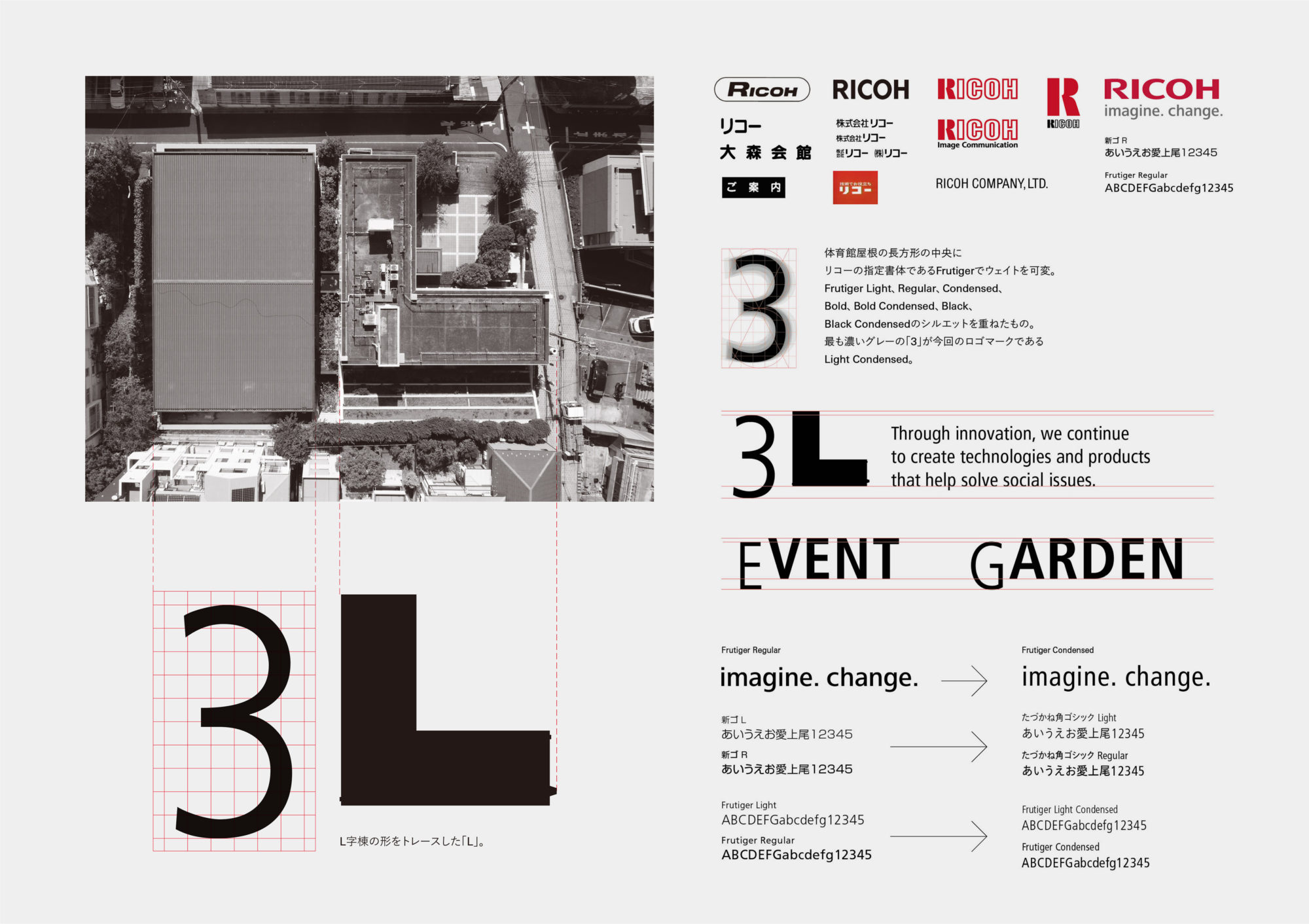
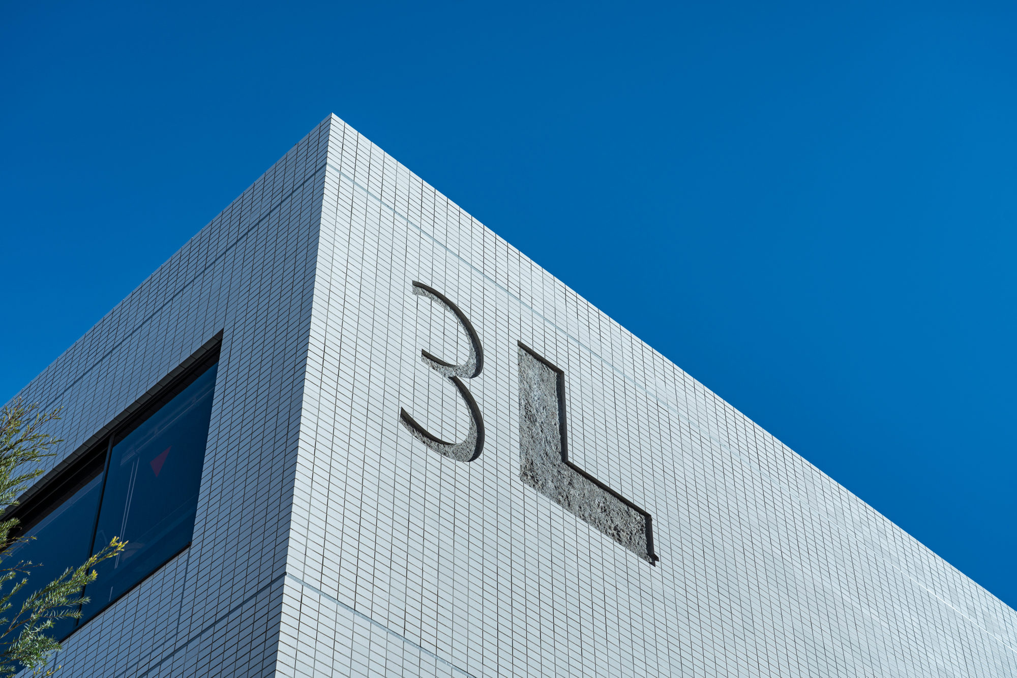
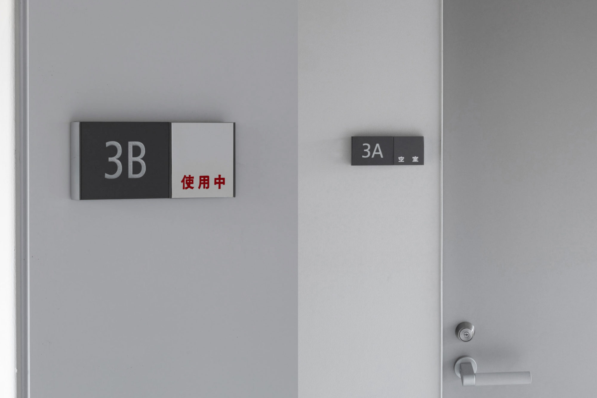
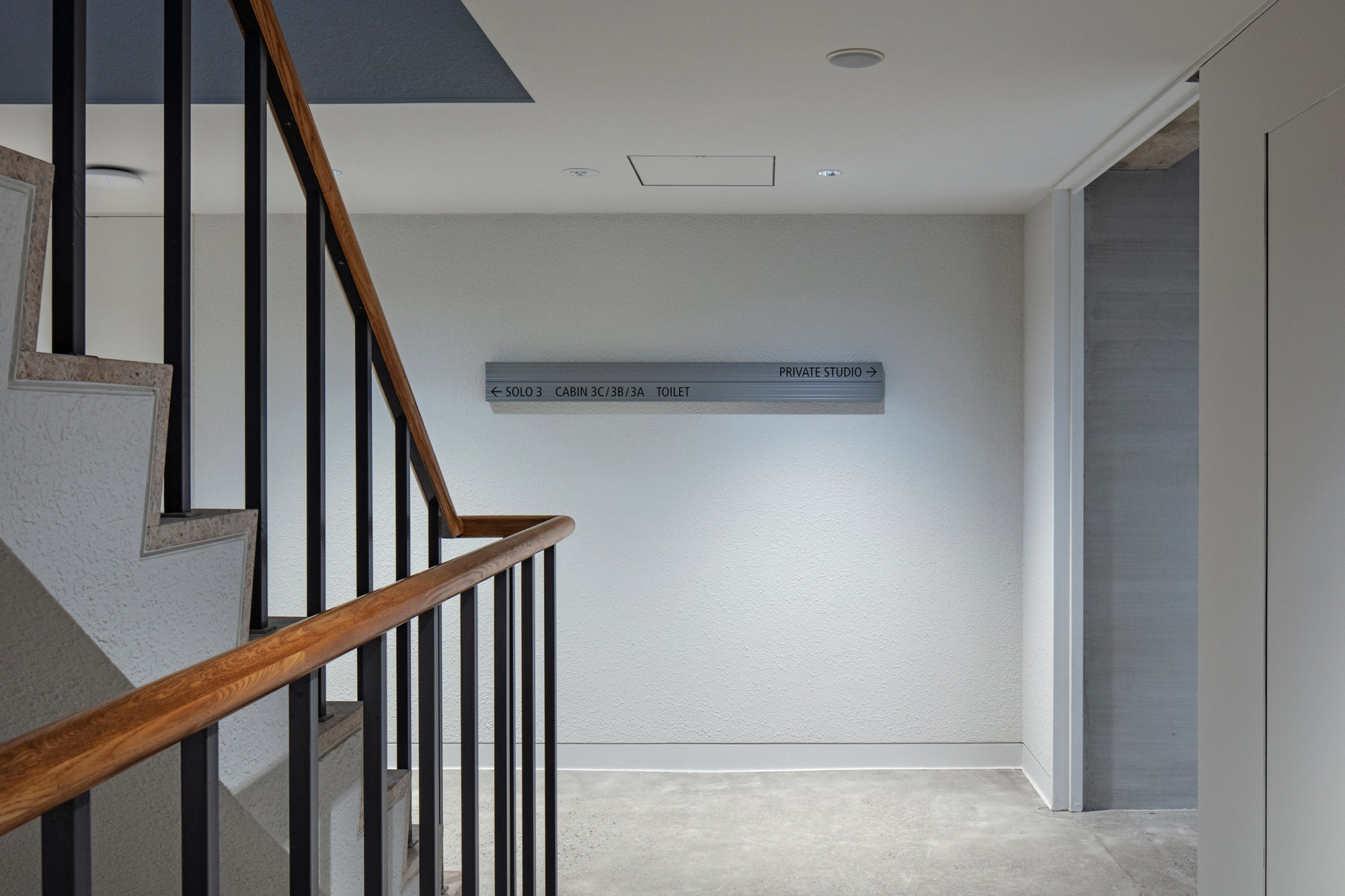
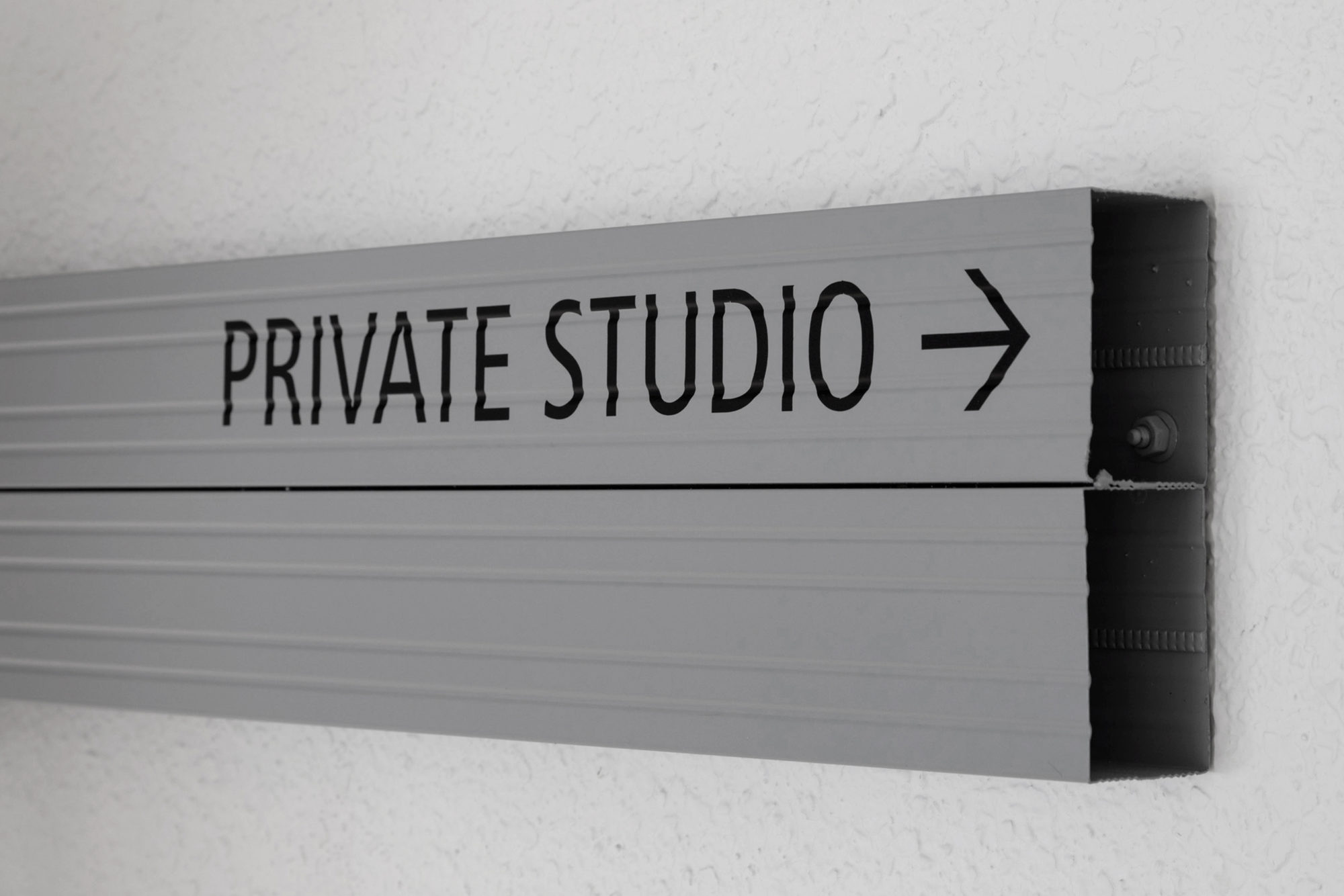
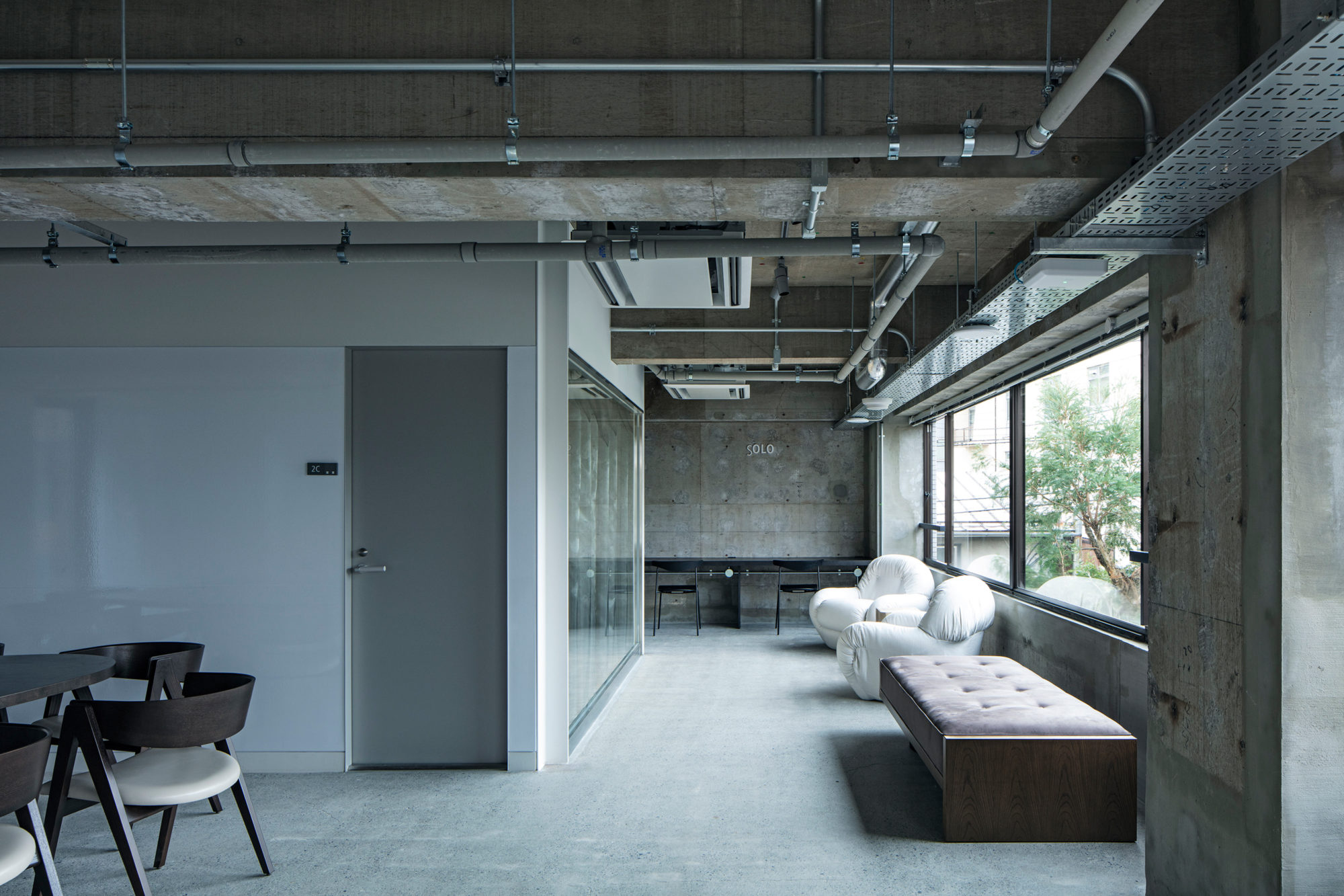
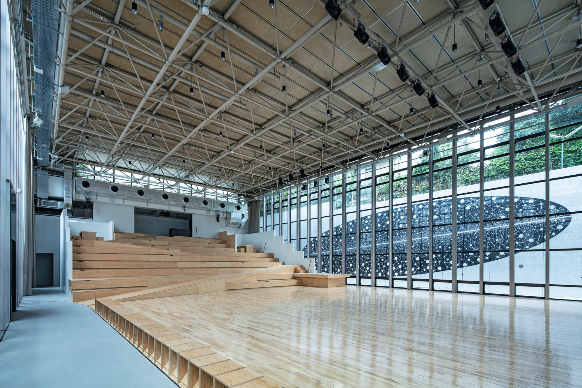
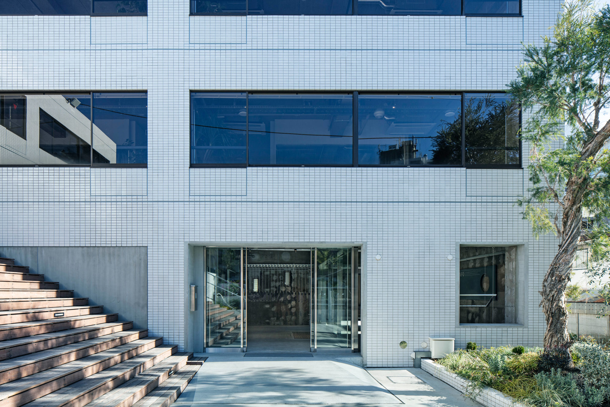
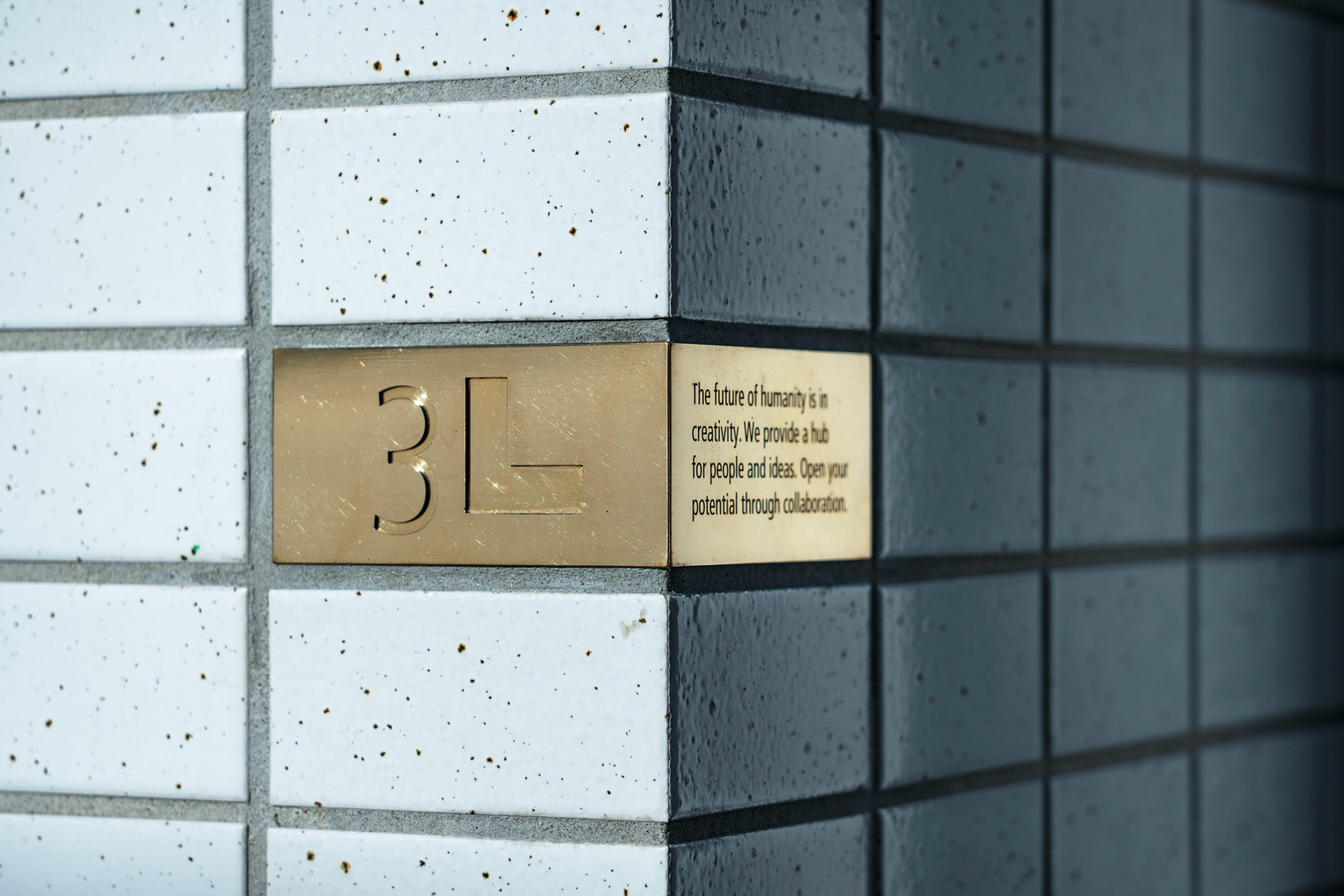
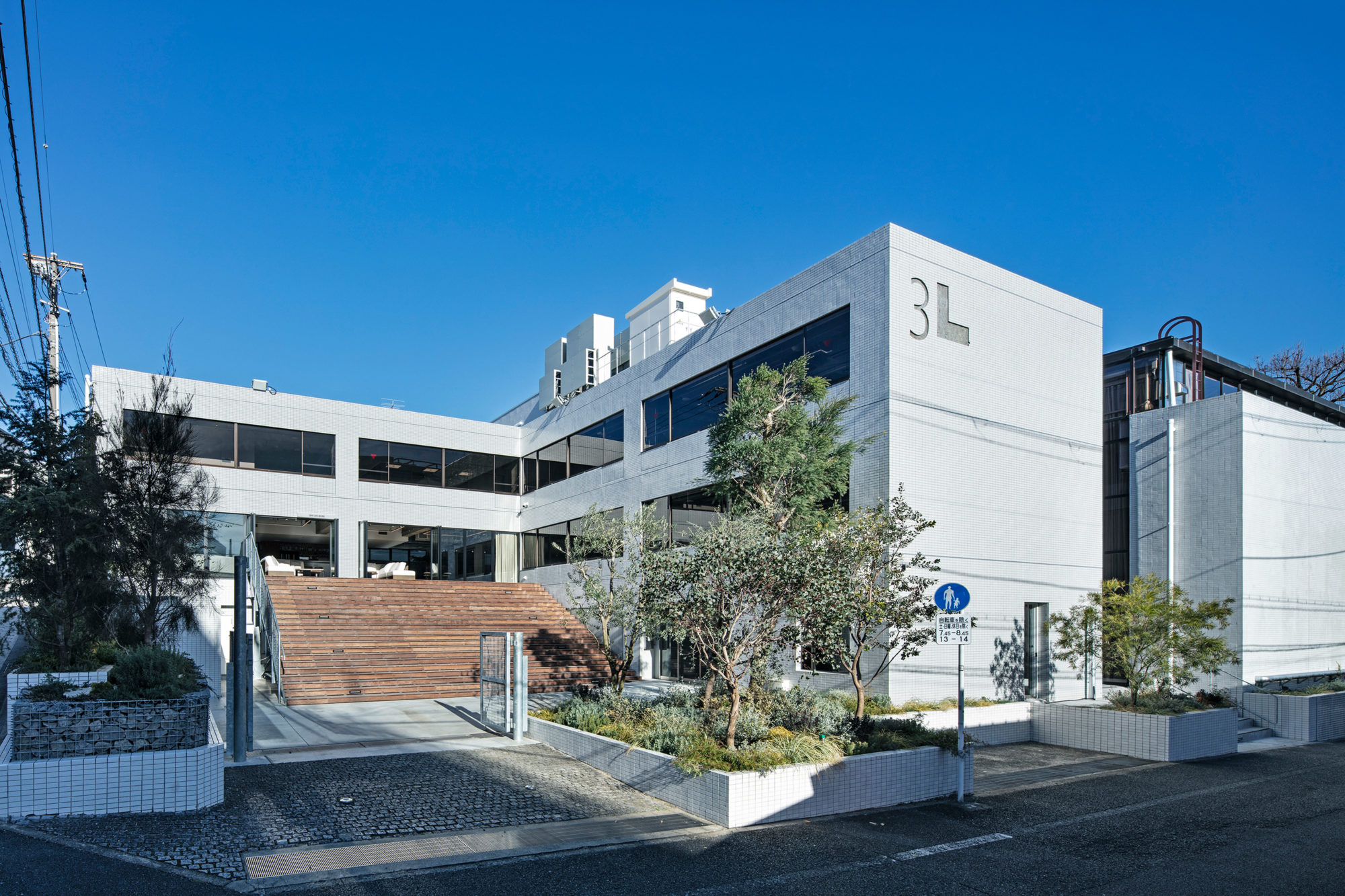
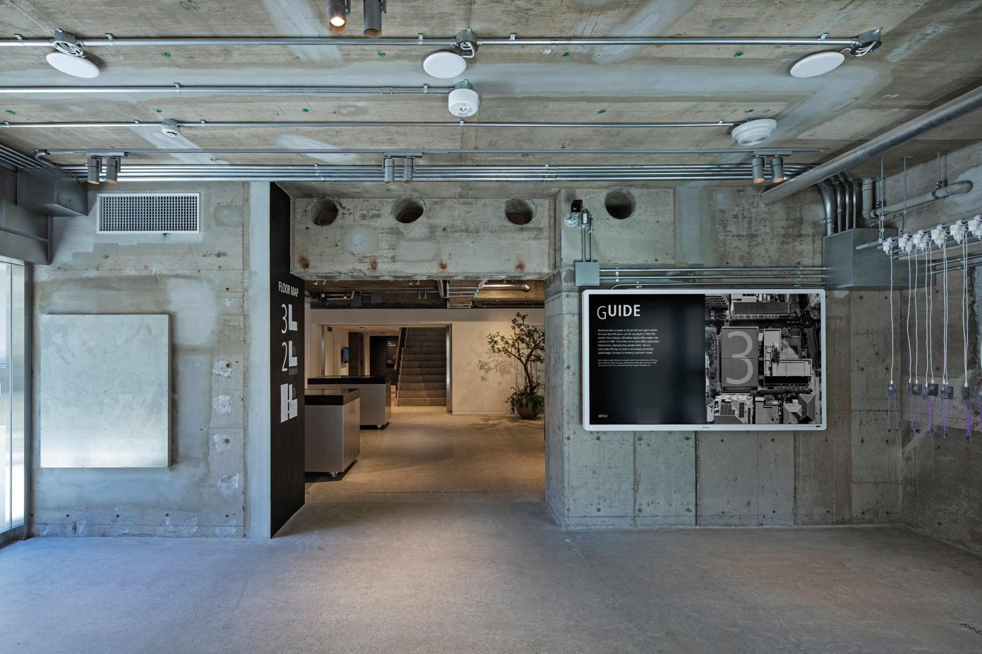
In 2020, on the occasion of the opening of RICOH workplace “3L,” Tanaka was in charge of V.I. and sign planning. “3L” was founded by fully renovating the Omori Hall, which is the origin of Mr. Kiyoshi Ichimura, the founder of RICOH. While inheriting it, the facility has a vision of providing future value as a “working as a team” recearch institute that makes the best use of indivisuals in places that are full of new ways of working by demonstrating individual humanity. The logo as an icon, visually embodies the vision of the facility when we looked at the building itself. Seeing from a bird’s-eye view, it is consisted of a square and an L-shaped building, the gymnasium. Therefore, it was made use of the outline and read as “3L.” The typeface of “3L” is based on Frutiger, which is a designated typeface of RICOH, and is aligned with the rectangle shape of the ceiling of the gymnasium and adopts the thickness of Light Condensed. The typeface used in conjunction with the logo is based on Frutiger while Tazukane Kaku Gothic is adopted for the Japanese typeface, as it was designed as a typeface suitable for Frutiger.
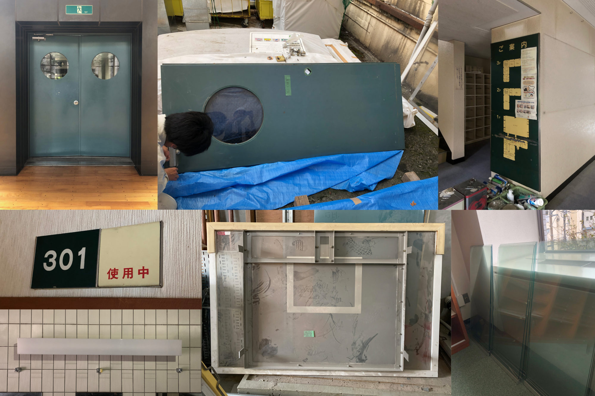
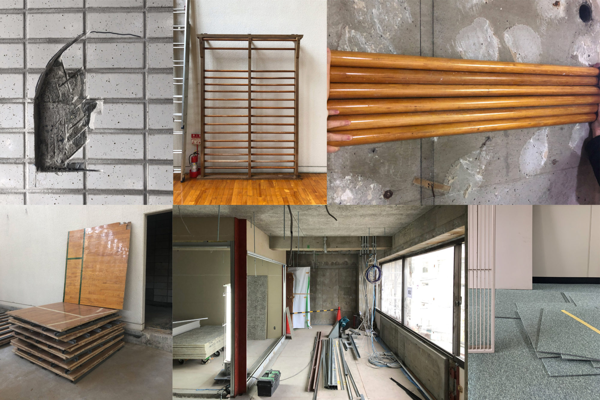
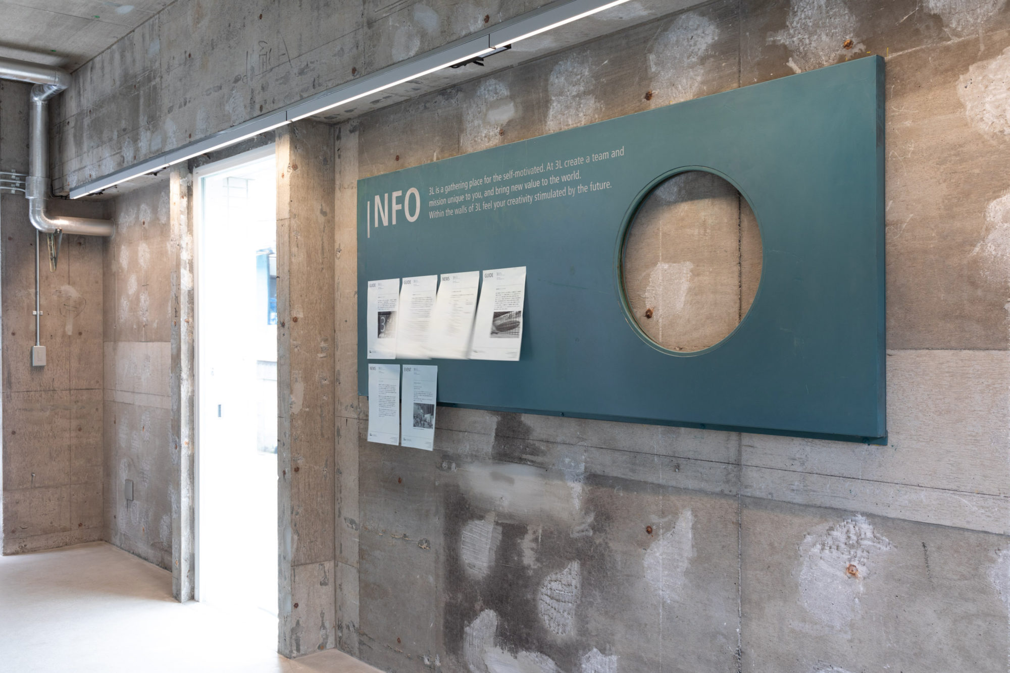
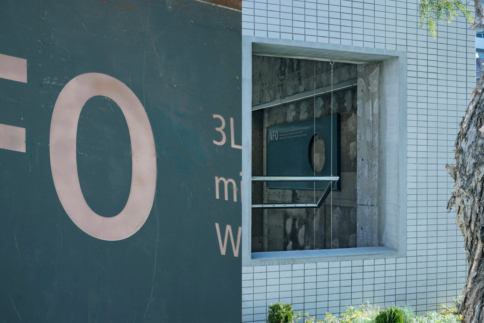
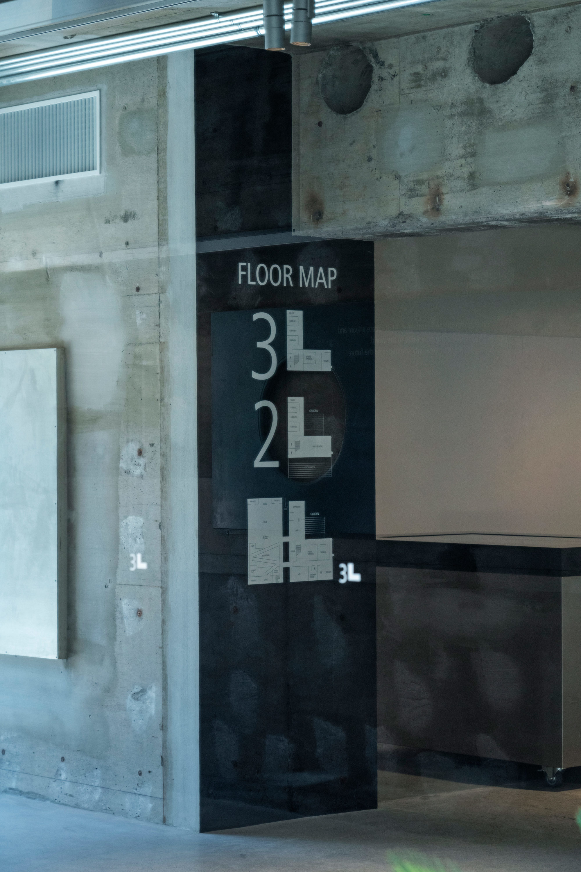
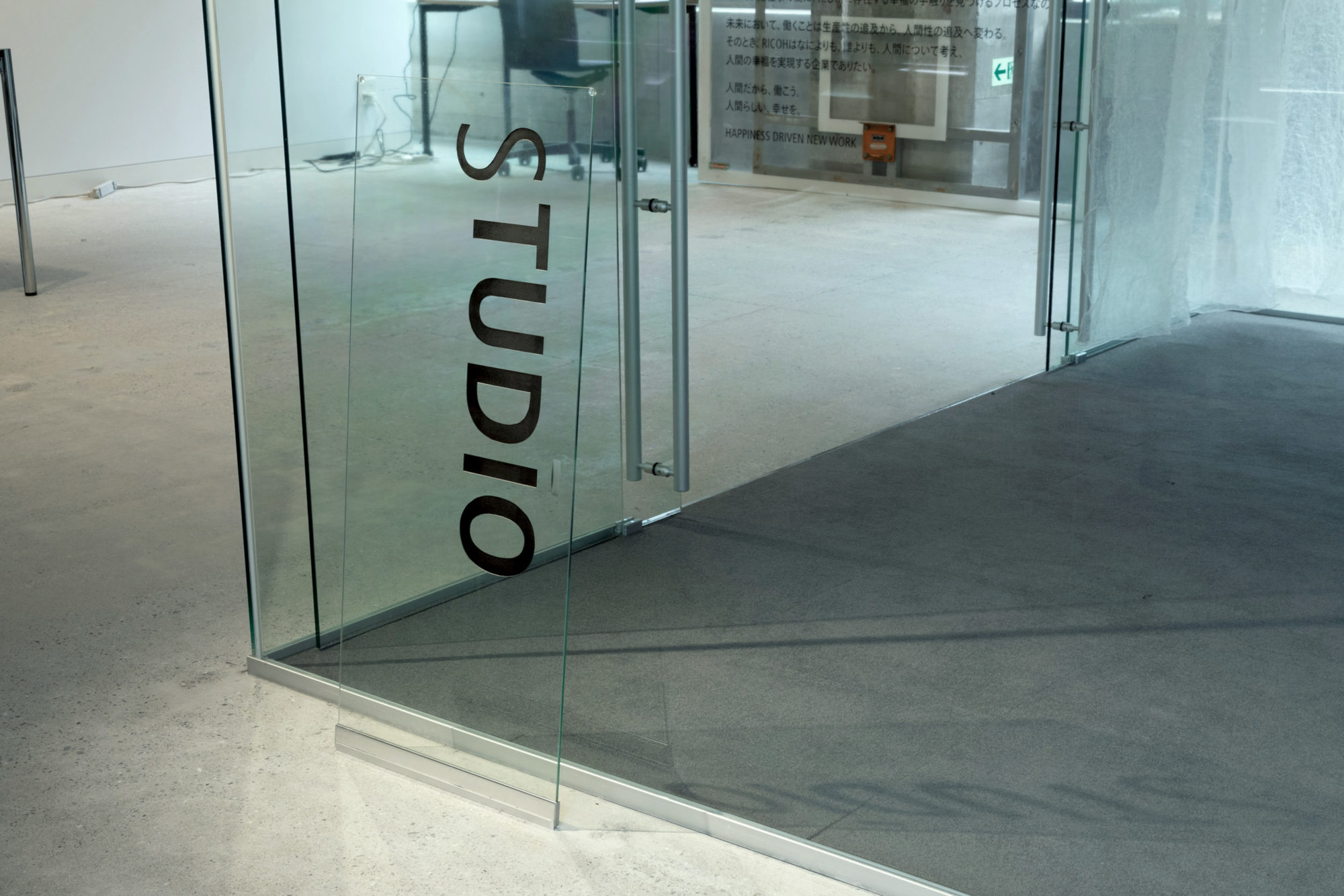
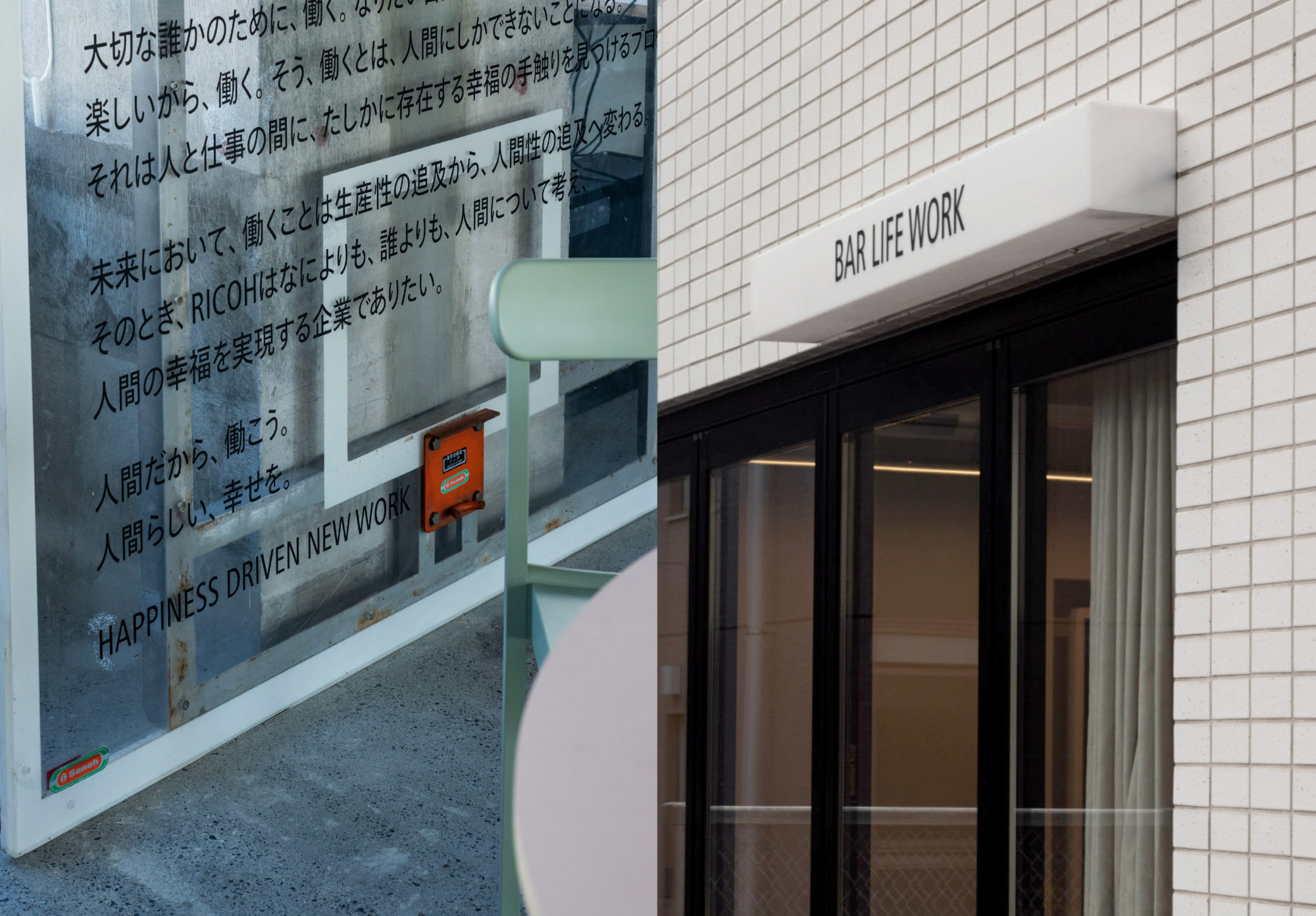
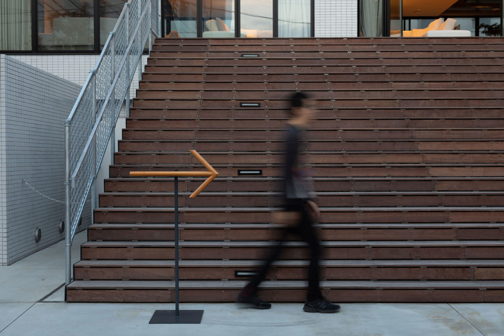
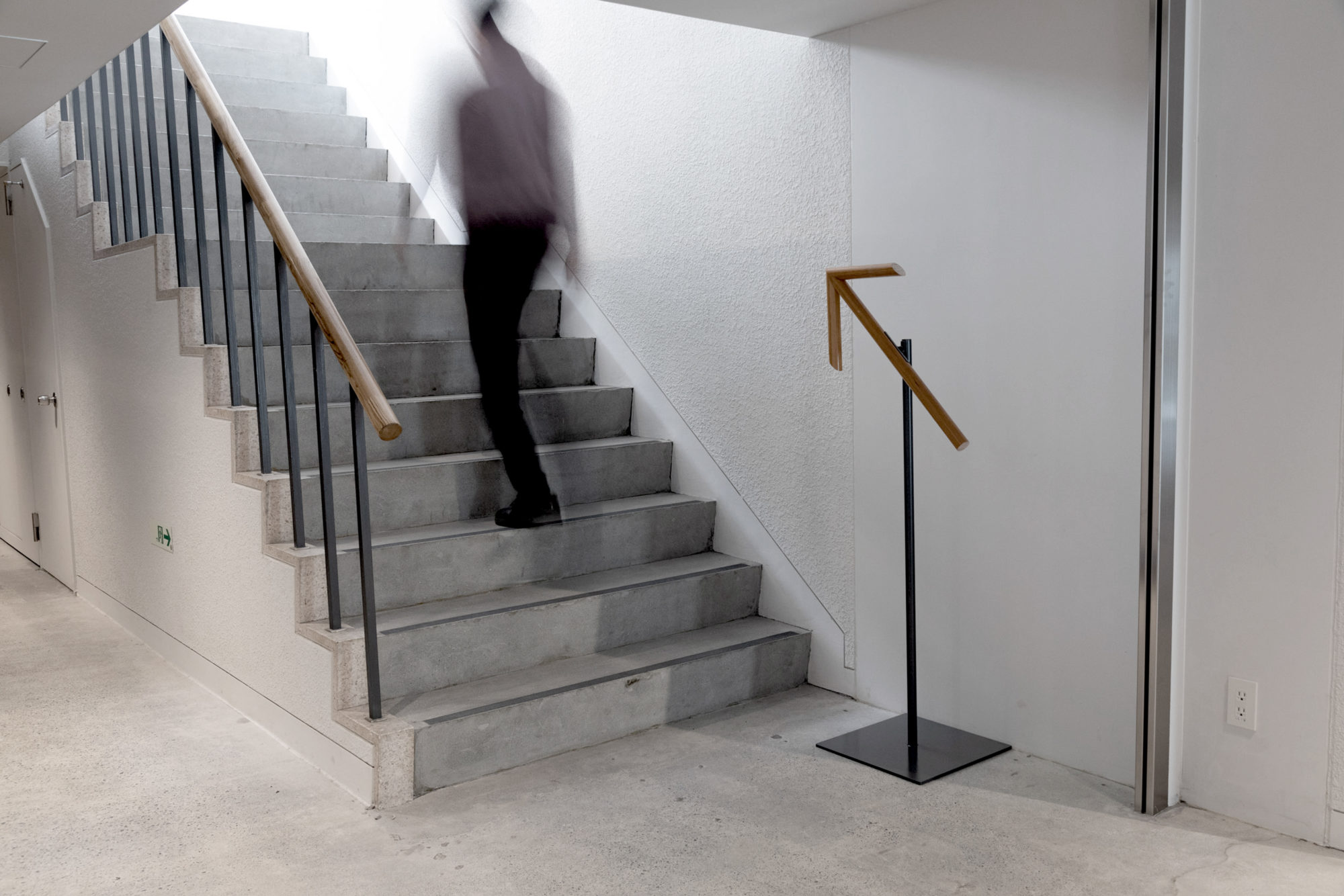
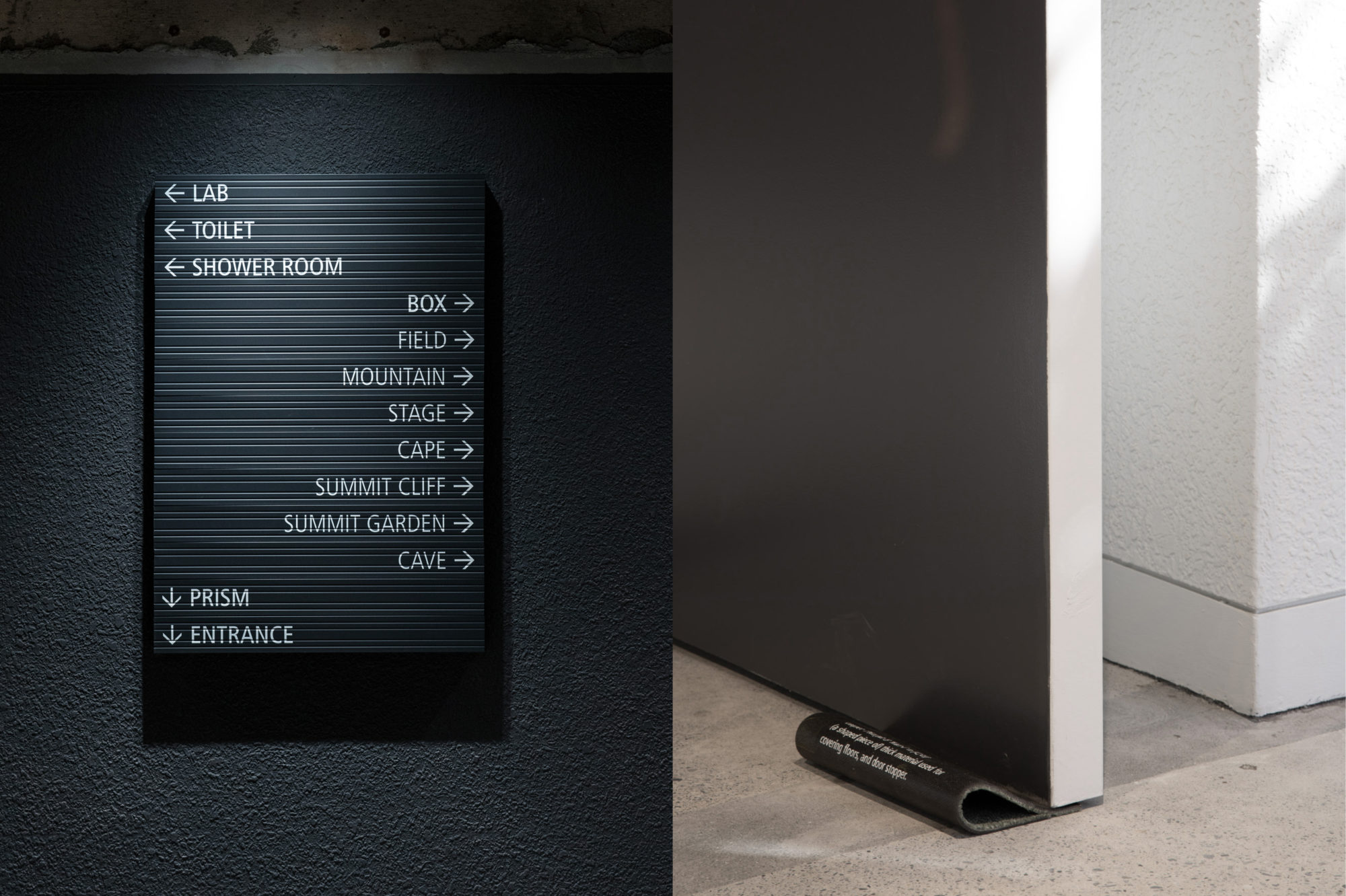
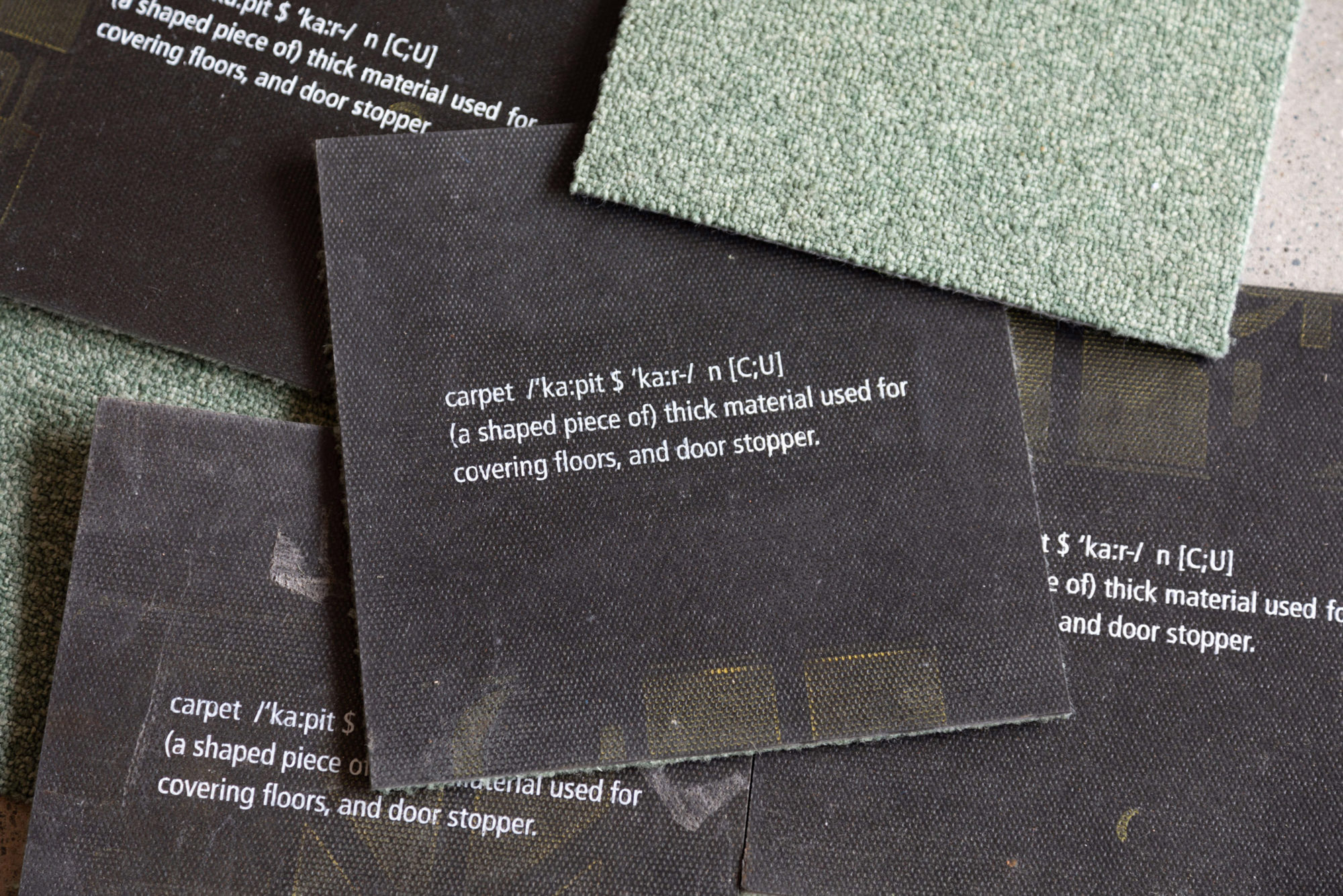
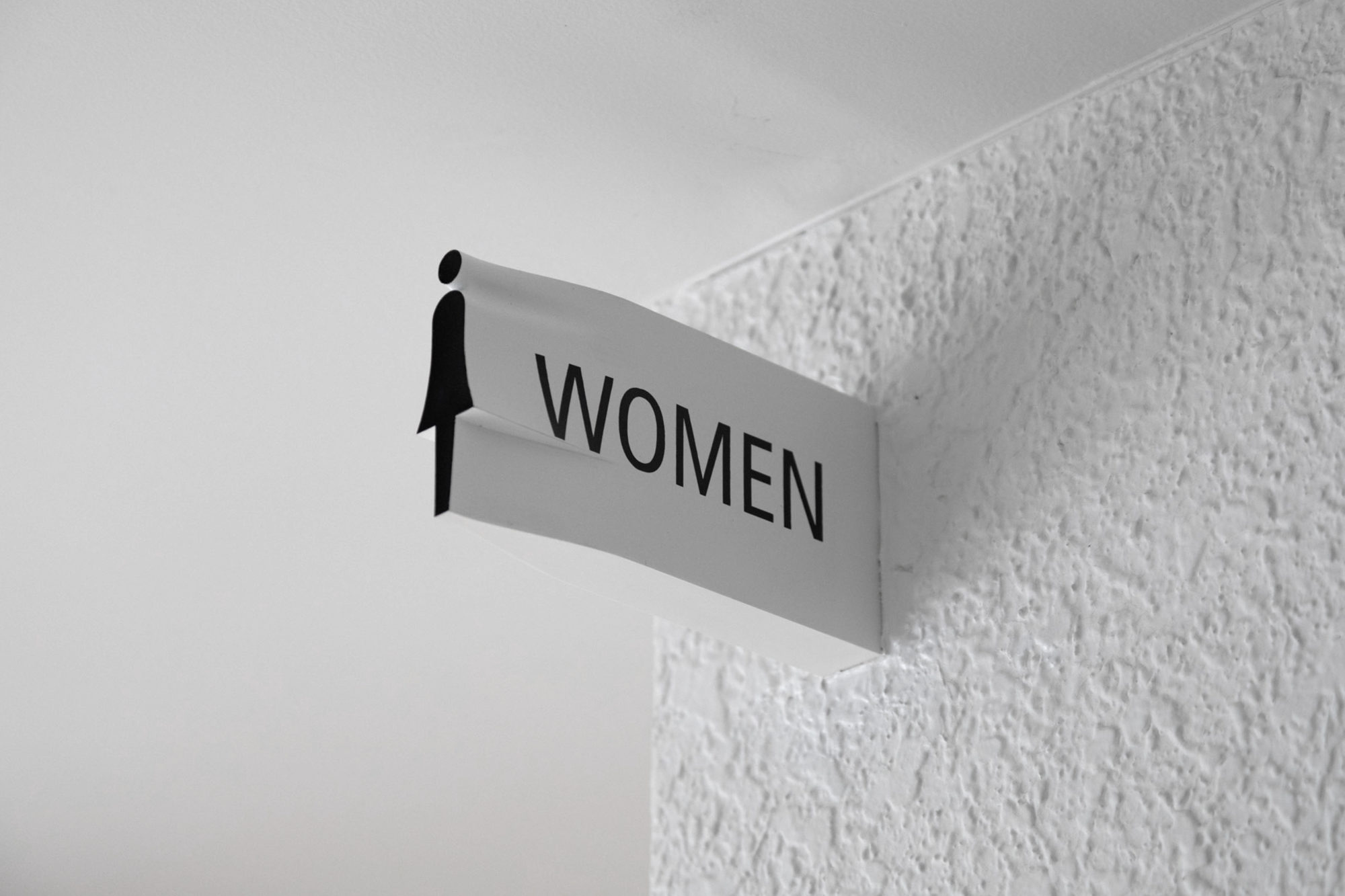
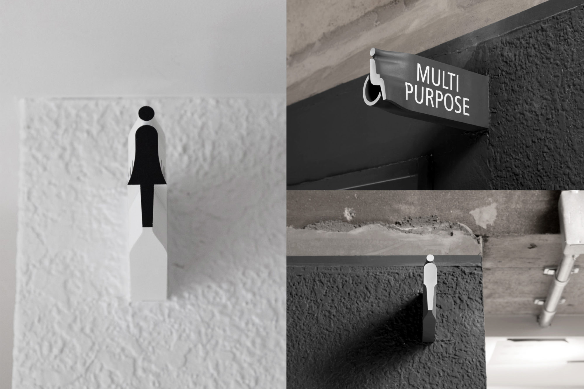
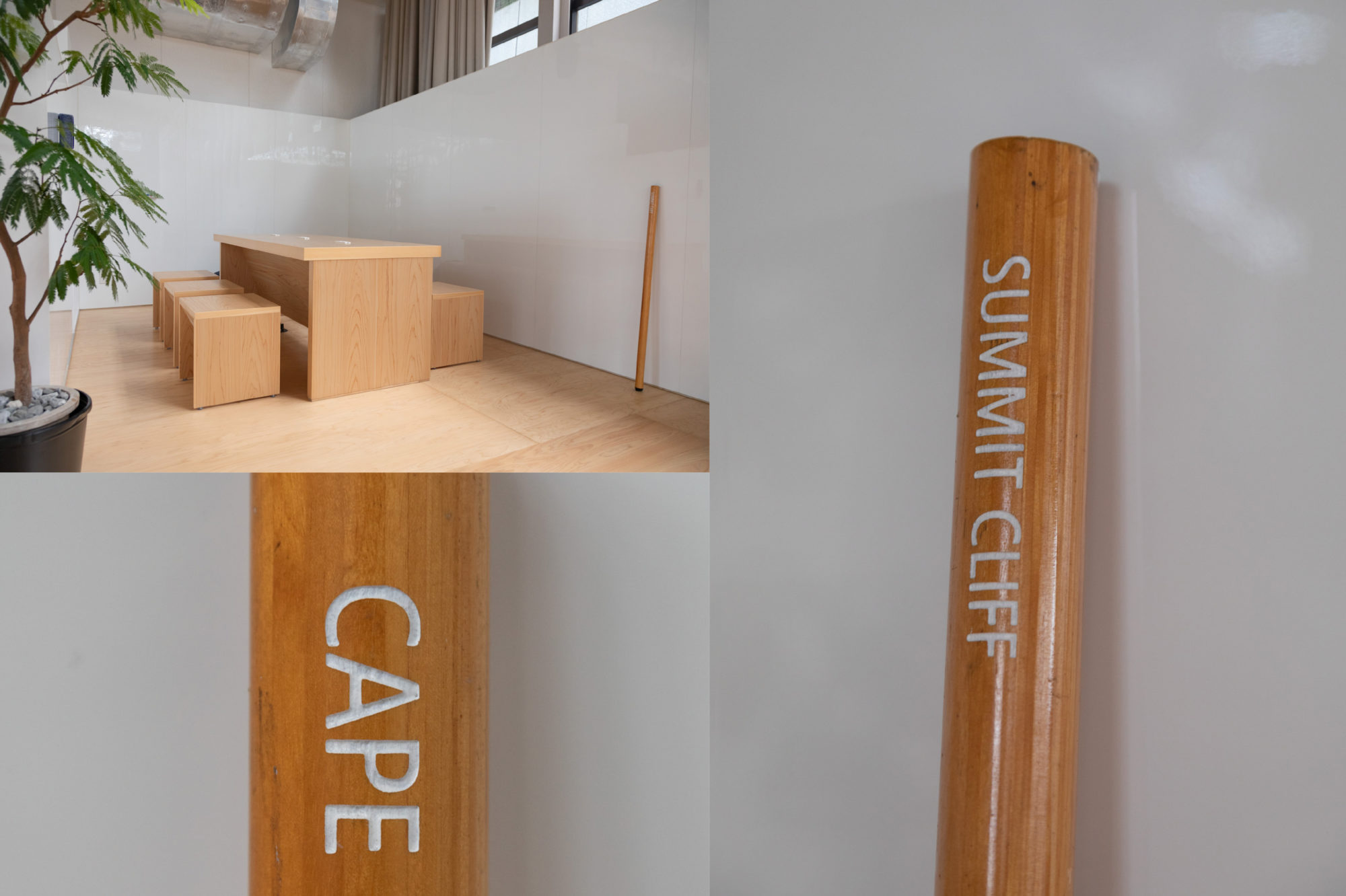
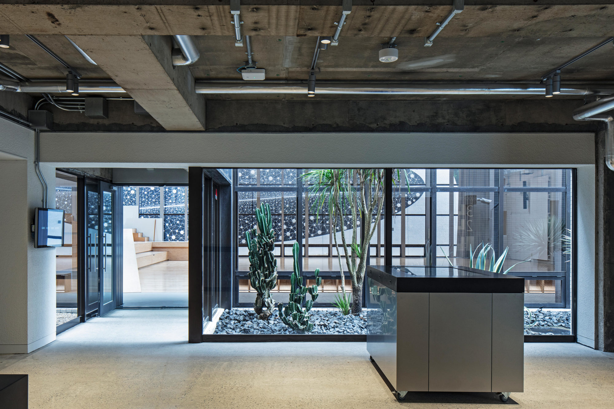
In the sign planning, it is aimed to unify the concept of inheritance and update to the present age as well as the concept of logo and typeface design. As for the way of architecture and space design, the means of [reconstruced architecture] was taken to devise a system that recycles the materials produced during demolition as a support for signs as much as possible, and renews them by combining new materials and typography. In 2021, an additional sign, “social distance” printed on transparent tape was created in response to the pandemic.
