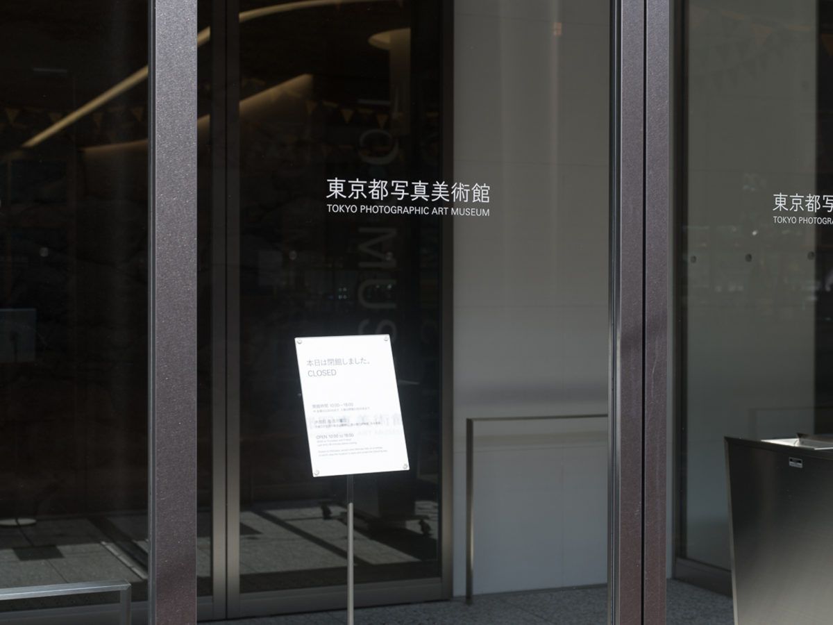
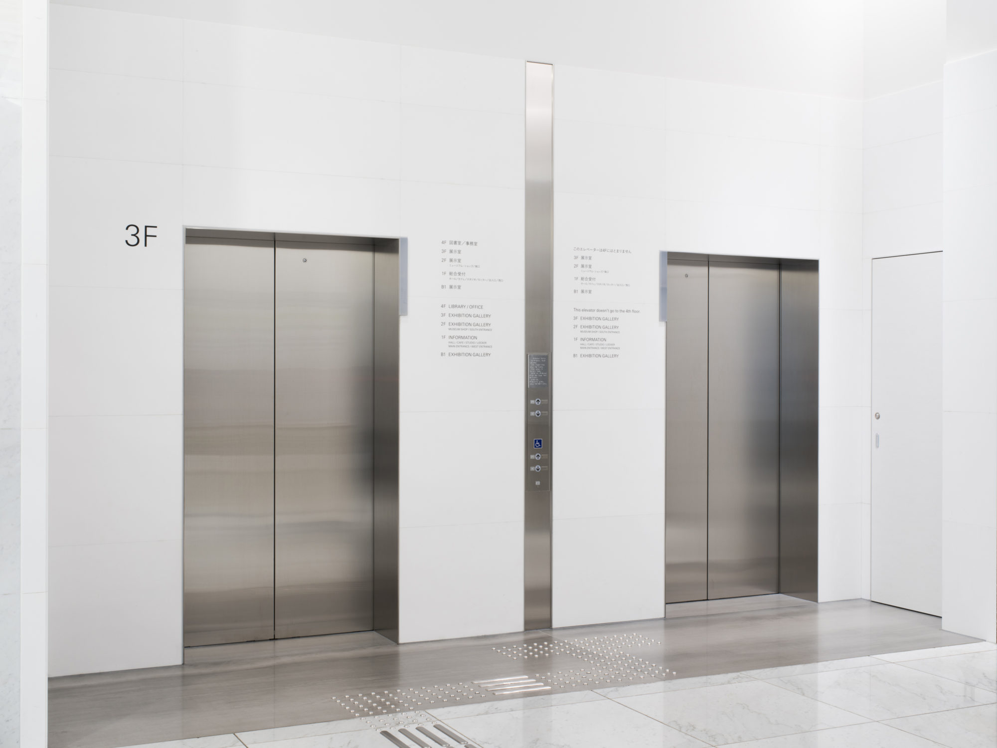
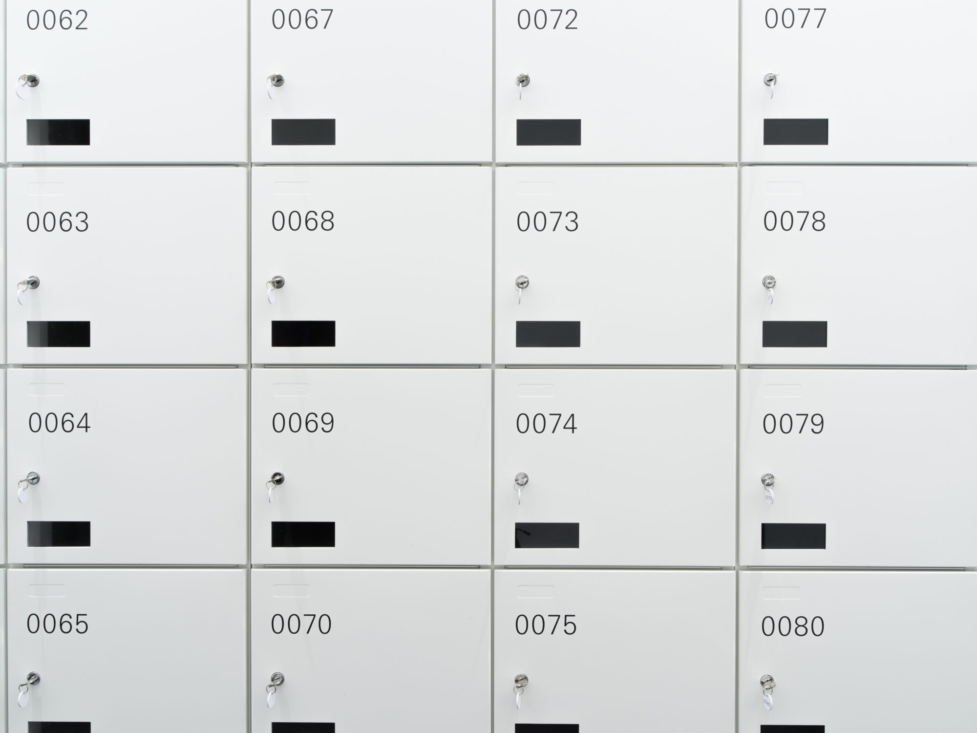
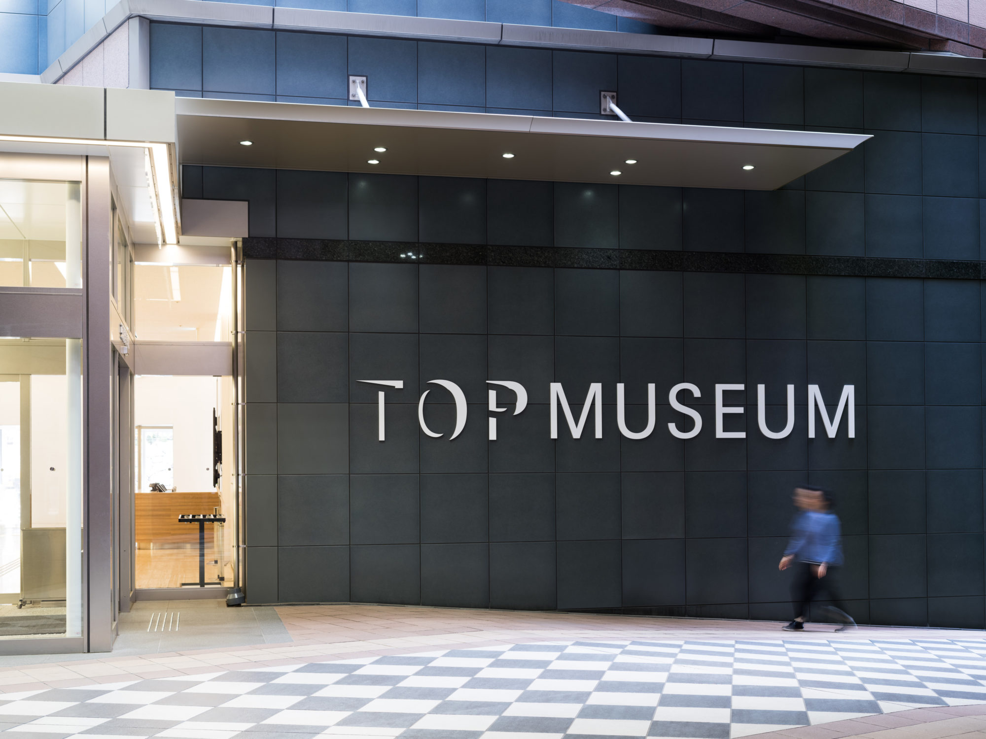
TOKYO PHOTOGRAPHIC ART MUSEUM
Identities
- Client
- Tokyo Photographic Art Museum
- Design
- centre: Yoshihisa Tanaka, Yoshiko Tanigawa
- Location
- Tokyo
- Period
- Sep 2016
- Photo
- Shintaro Yamanaka
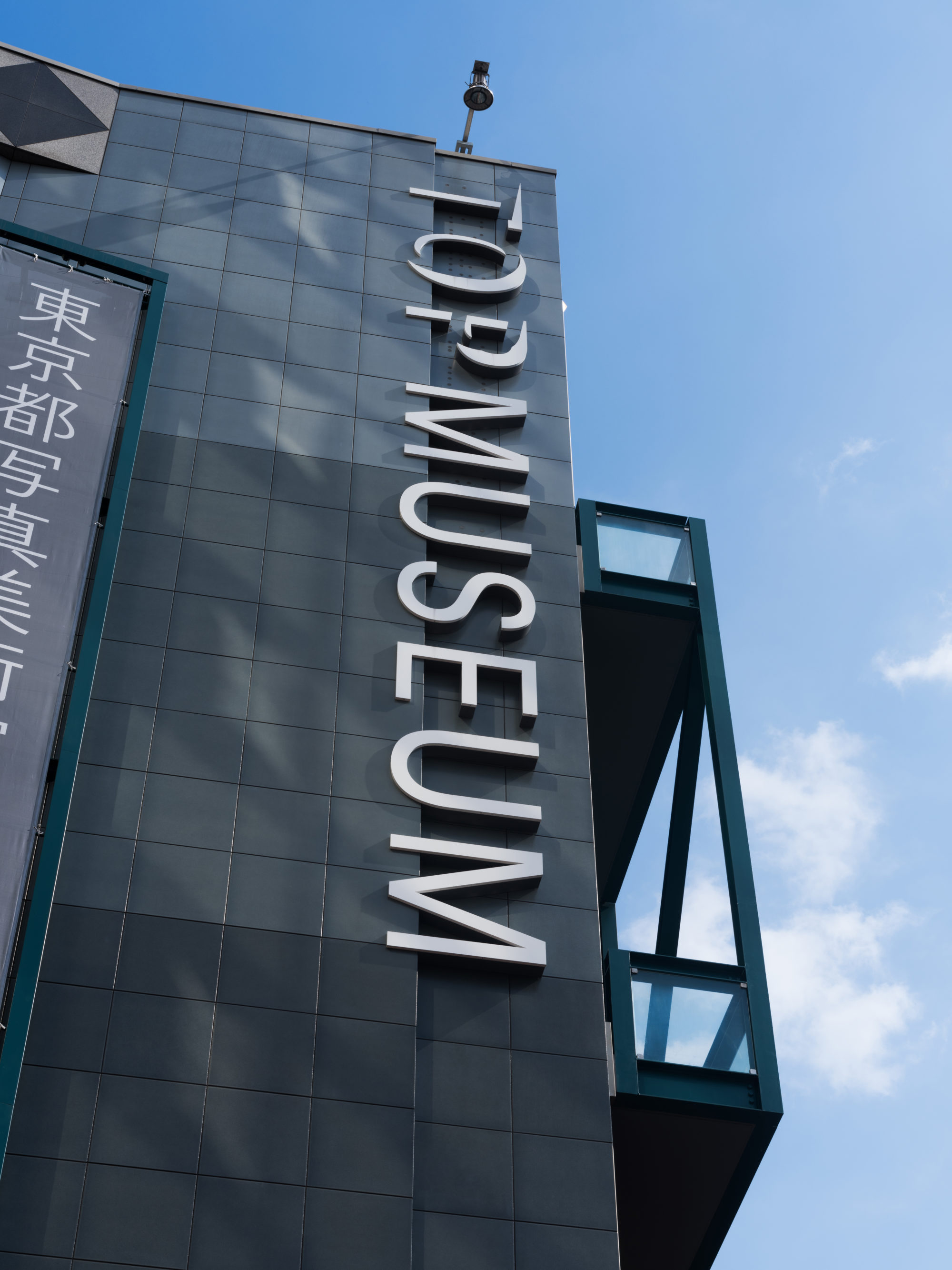
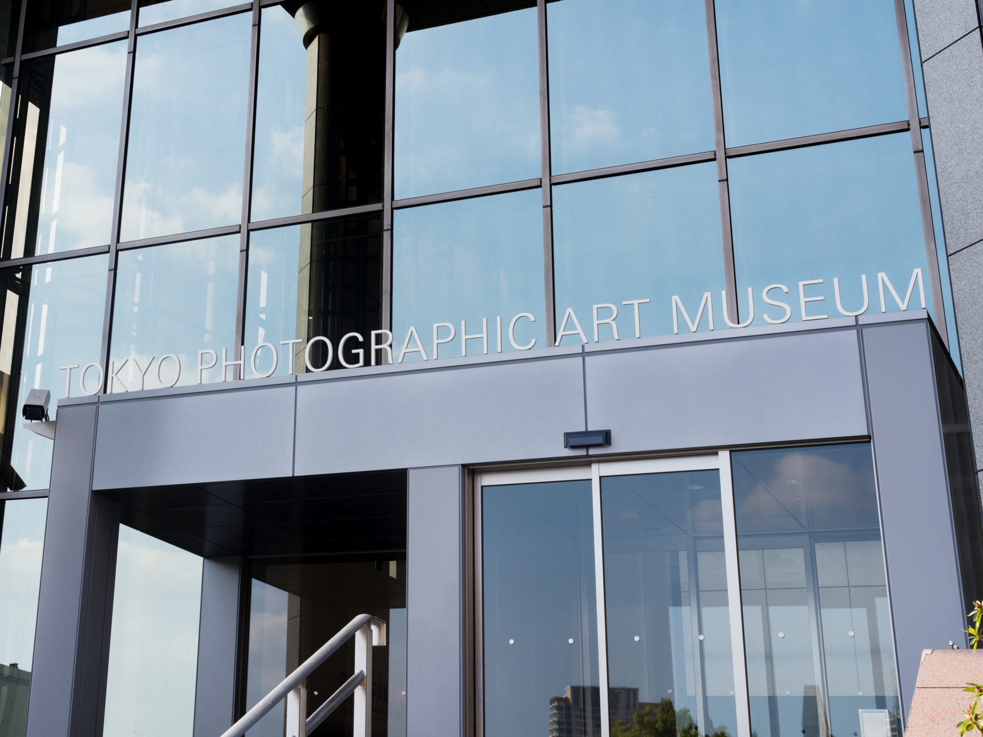
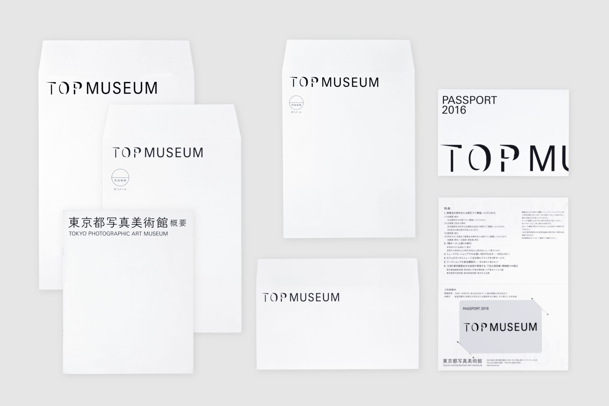
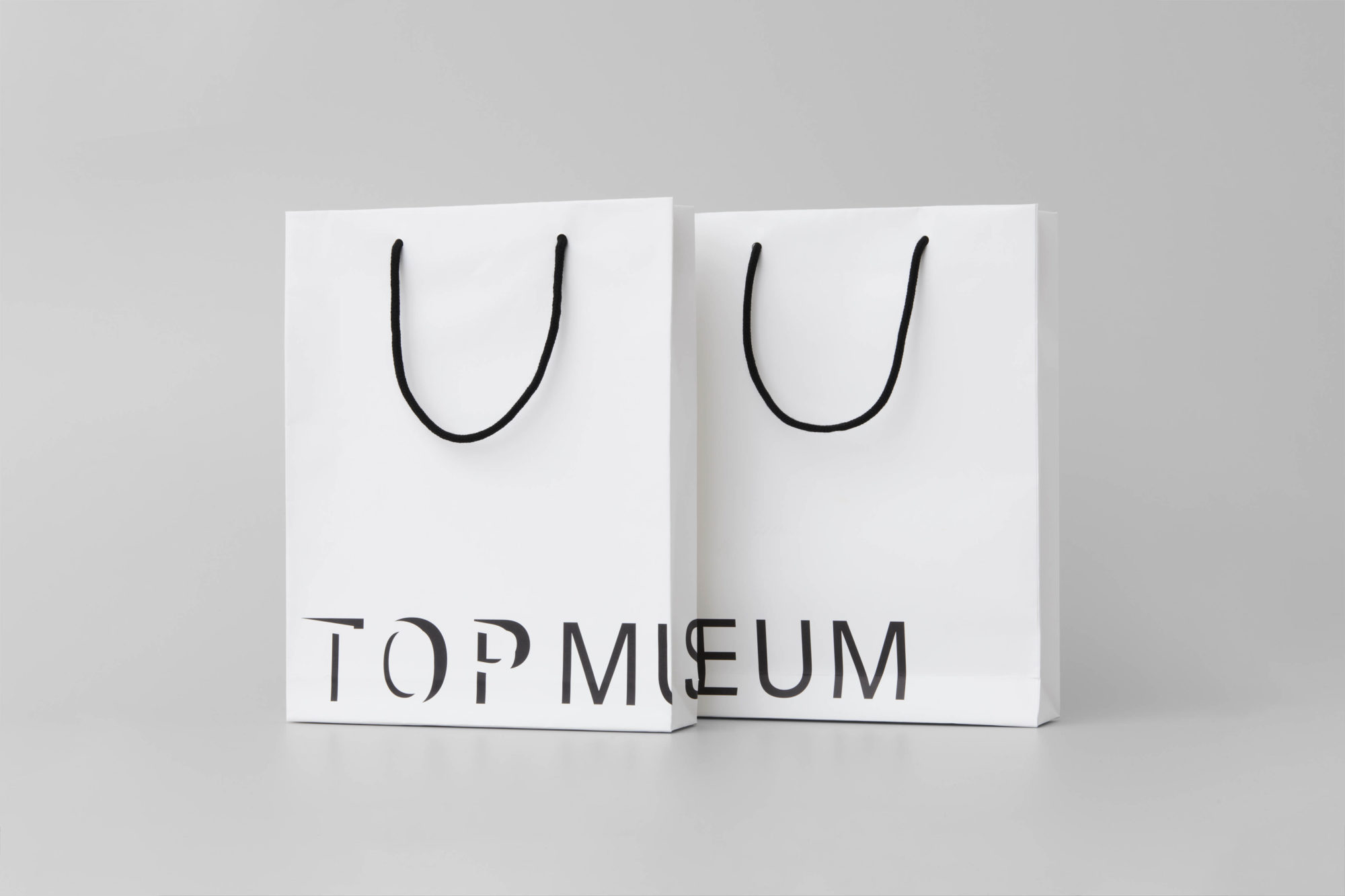
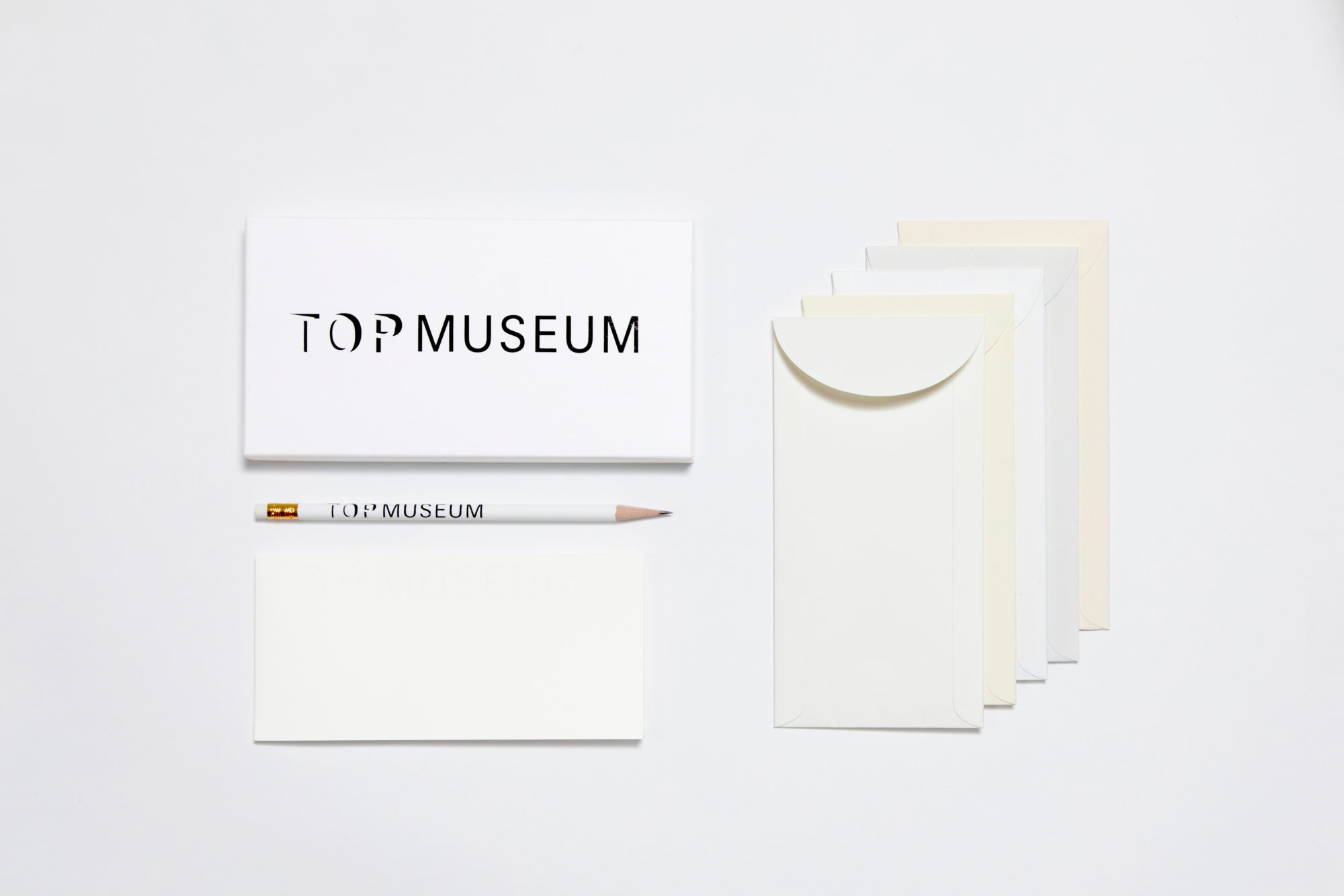
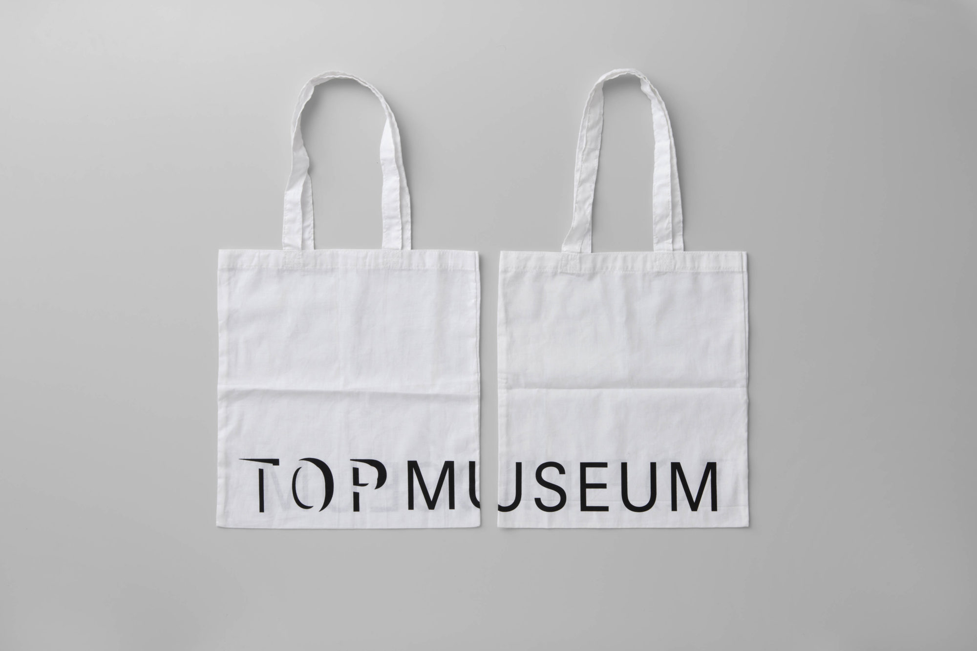
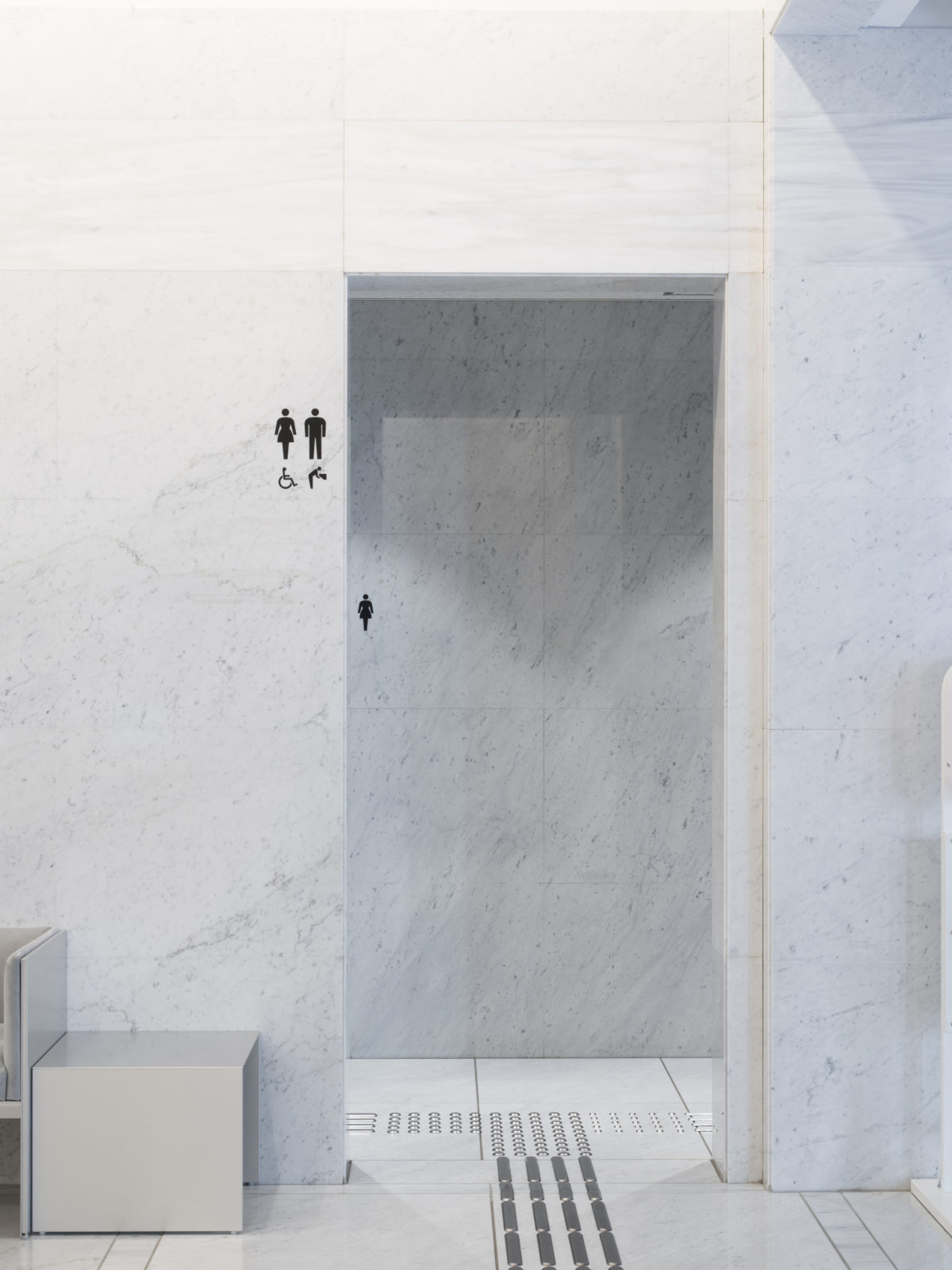
In conjunction with the reopening of the 20th anniversary of the Tokyo Photographic Art Museum, in charge of creating new logo and logotypes, sign planning and stationery.
The symbol mark highlights the new museum name “TOP” by strikingly using light which creates photographs and images. “TOP” looks like opening the door, represents the depth and spatiality of the museum, opens the door of new expression, and imagines the mind to welcome visitors.
For the typeface used with the symbol mark, Yu Gothic was selected as a durable typeface which does not change its beauty even after many years of use, in harmony with various environments and works. The Japanese logotype is also by Osamu Torinoumi (JIYUKOBO Ltd.).
more Identities
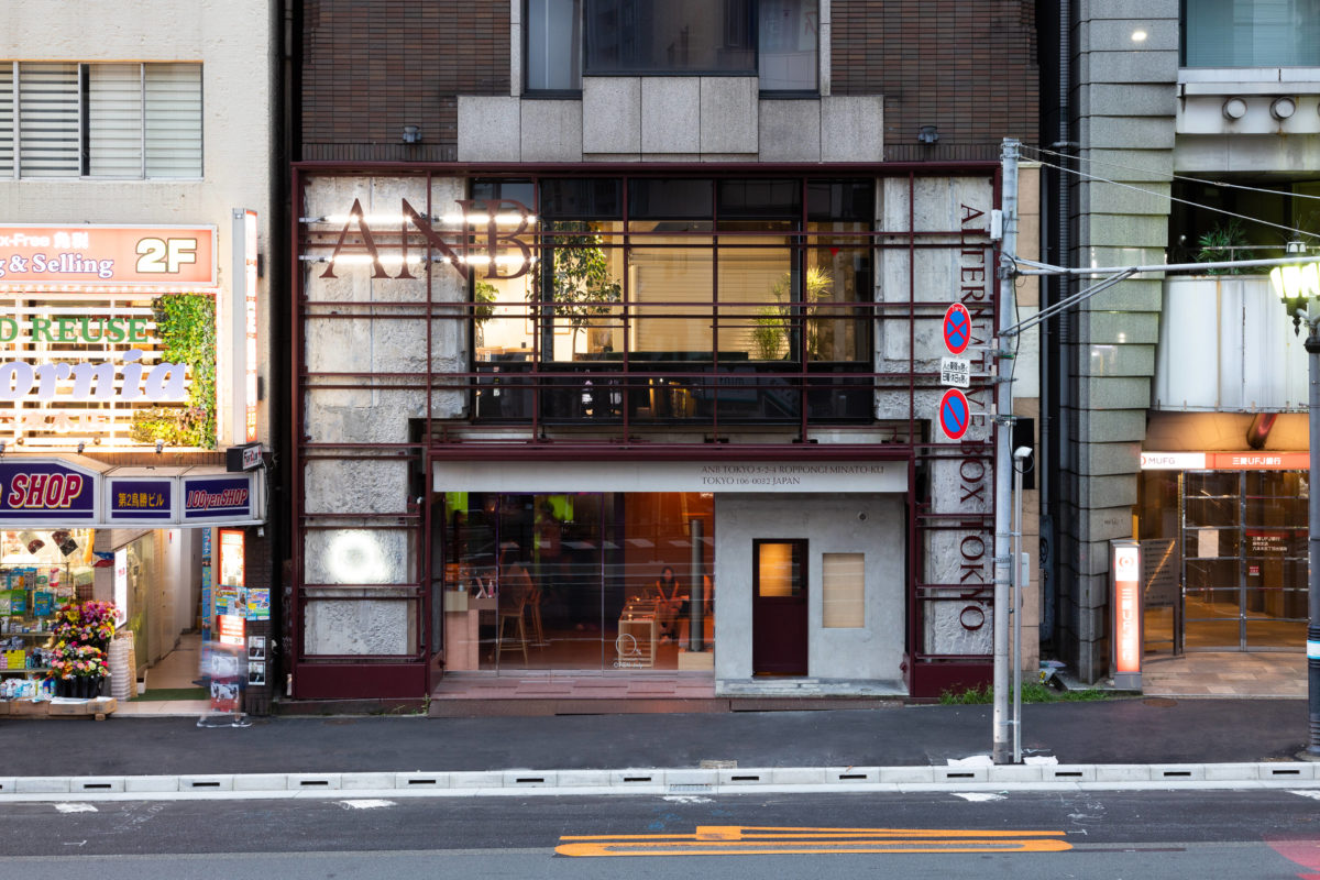
ANB Tokyo
- Client
- Tokyo Art Acceleration
- Curator
- Junya Yamamine
- Design
- Yoshihisa Tanaka, Yutaro Yamada
- Web design
- IN FOCUS
- Period
- April 2020
- Photo
- Shintaro Yamanaka (Qsyum!)

Gallery 5
- Client
- limArt co., ltd
- Director
- Yusuke Nakajima (limArt co., ltd)
- Design
- Yoshihisa Tanaka
- Architects
- Schemata Architects
- Period
- Apr 2022 – ongoing
- Photo
- Kenta Hasegawa
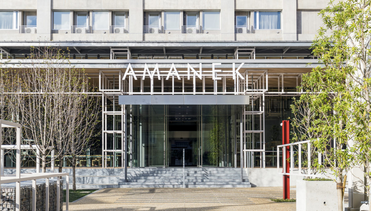
AMANEK in BEPPU
- Client
- AMANEK
- Basic design and supervisor
- SAISEI LABORATORY
- Construction
- Wadagumi
- Low-rise structural design
- Enshu Structural Consultants
- Design
- Yoshihisa Tanaka, Yutaro Yamada
- Photo
- Anna nagai
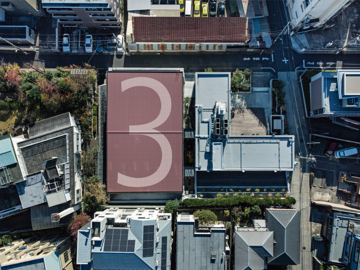
3L
- Client
- Ricoh Company, Ltd.
- Director
- Jun Inada
- Design
- Yoshihisa Tanaka, Yutaro Yamada
- Supervisor
- HIROYUKI TANAKA ARCHITECTS
- Wall drawing
- Hiraku Suzuki
- Web design
- Shed Inc.
- Interior
- TANK Inc.
- Cooperation for sign
- Fujiwara Earthen Art Studio, Paint Factory
- Period
- Oct 2020
- Photo
- Kenta Hasegawa, Den Gai